Understanding the user
User research: summary
A primary user group identified through research was women athletes with
lack of confidence regarding online buying for cycling clothes. This user
group confirmed initial assumptions about Zona5 customers, but research also
revealed that these women were frustrated with the lack of possibilities
regarding sports garments specially designed for women. Most of them ended
up buying unisex clothing and had experienced injuries after high
performance training sessions with clothes designed for men.
User’s pain points
Distrust
Lack of confidence when choosing clothing sizes online. Most women
prefer to buy clothes at stores.
Return policies
Most users have a hard time trying to change a product or getting their
money back.
Time
Women athletes have little free time between work and housework to shop
for clothes at local stores.
Support
Customers feel frustrated when they can’t access human support center.
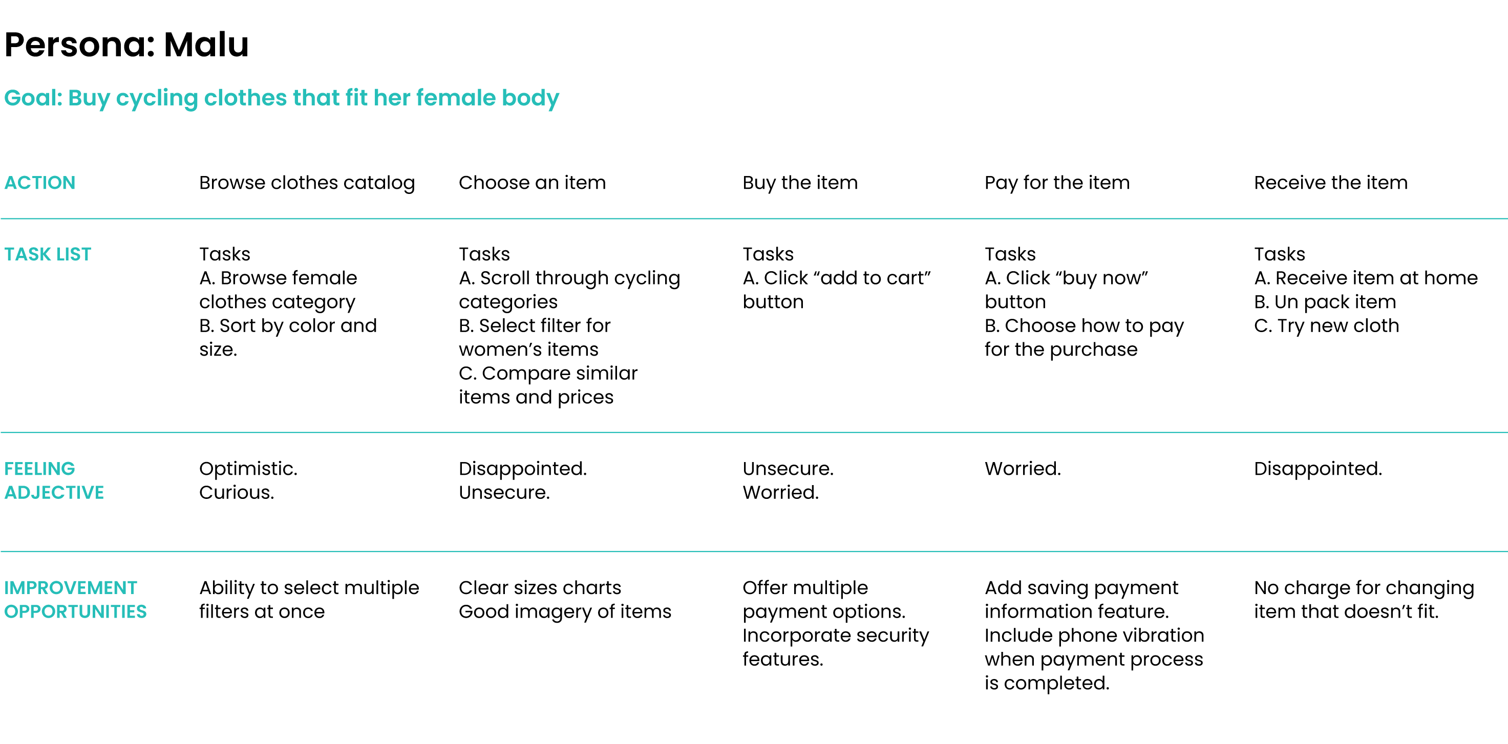
Meet the User

User problem statement
“It doesn’t matter what you do, only how well you do it”
Goals
- Just focus on training.
- Getting the perfect fit for the perfect training session.
Frustrations
- Unisex clothing that doesn’t fit women’s bodies.
- Trouble choosing clothing sizes online.
Malu is a busy photographer and amateur cyclist who needs to easily buy for cycling clothes online that fits her female body because she doesn’t have time to go try on clothes at local stores.
Malu is a 36 years old freelance photographer, passionate about cycling.
She takes her sport seriously. Malu thinks the only way to get better at
any sport is focusing only on technique and heart rate. She follows a
very structured training session her trainer designs for her. She gets
annoyed when something like clothing or malfunctioning bike gadgets
distract her form training. Her job has flexible hours but, in order to
make a living from photography she has to work long hours and on
weekends, that doesn’t leave her much free time to go shopping for
clothes at local stores.
User Journey Map
Mapping Malu’s user journey revealed how helpful it would be for ZONA5
female customers to have access to a friendly and reliable online store.
Starting the Design
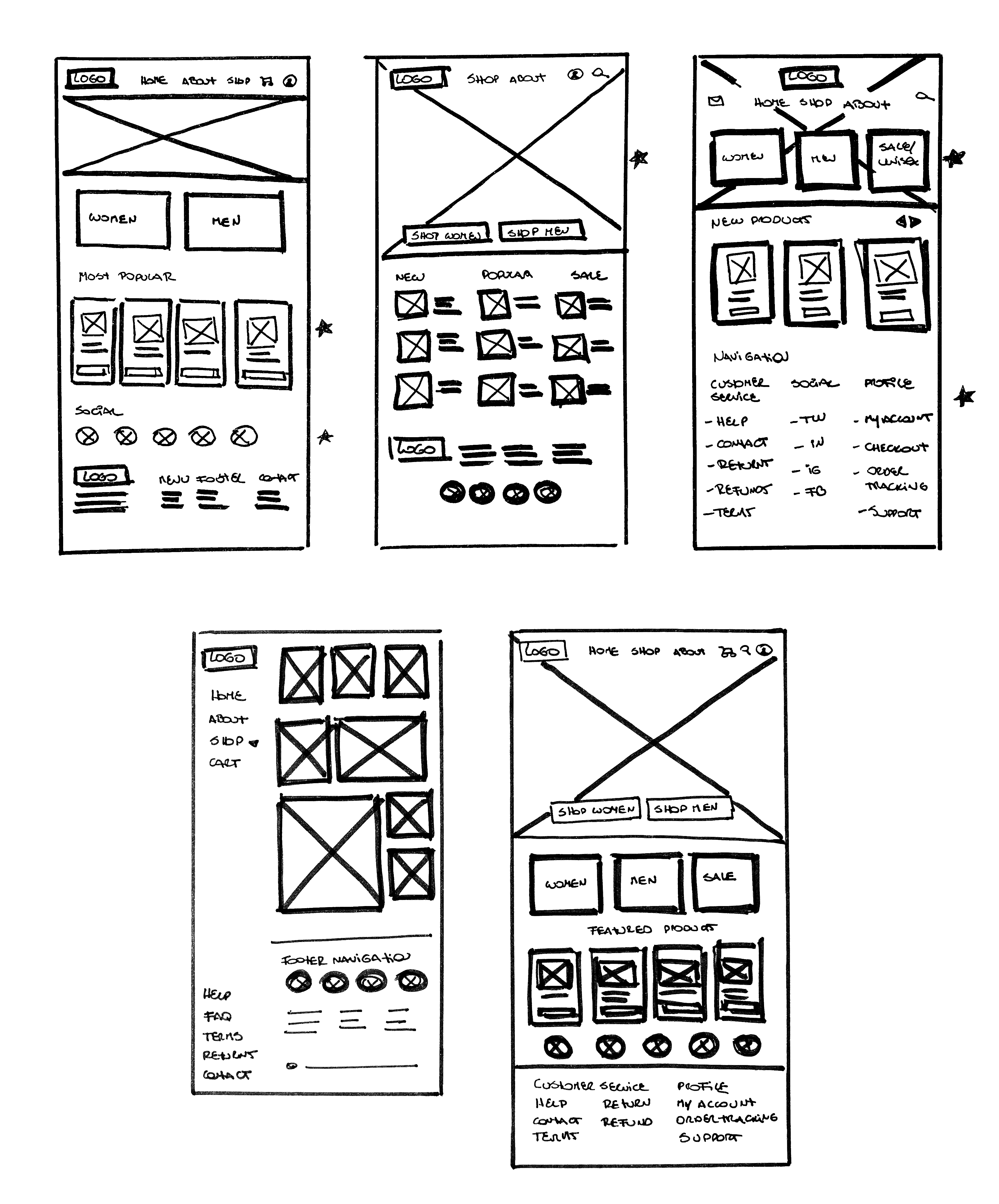
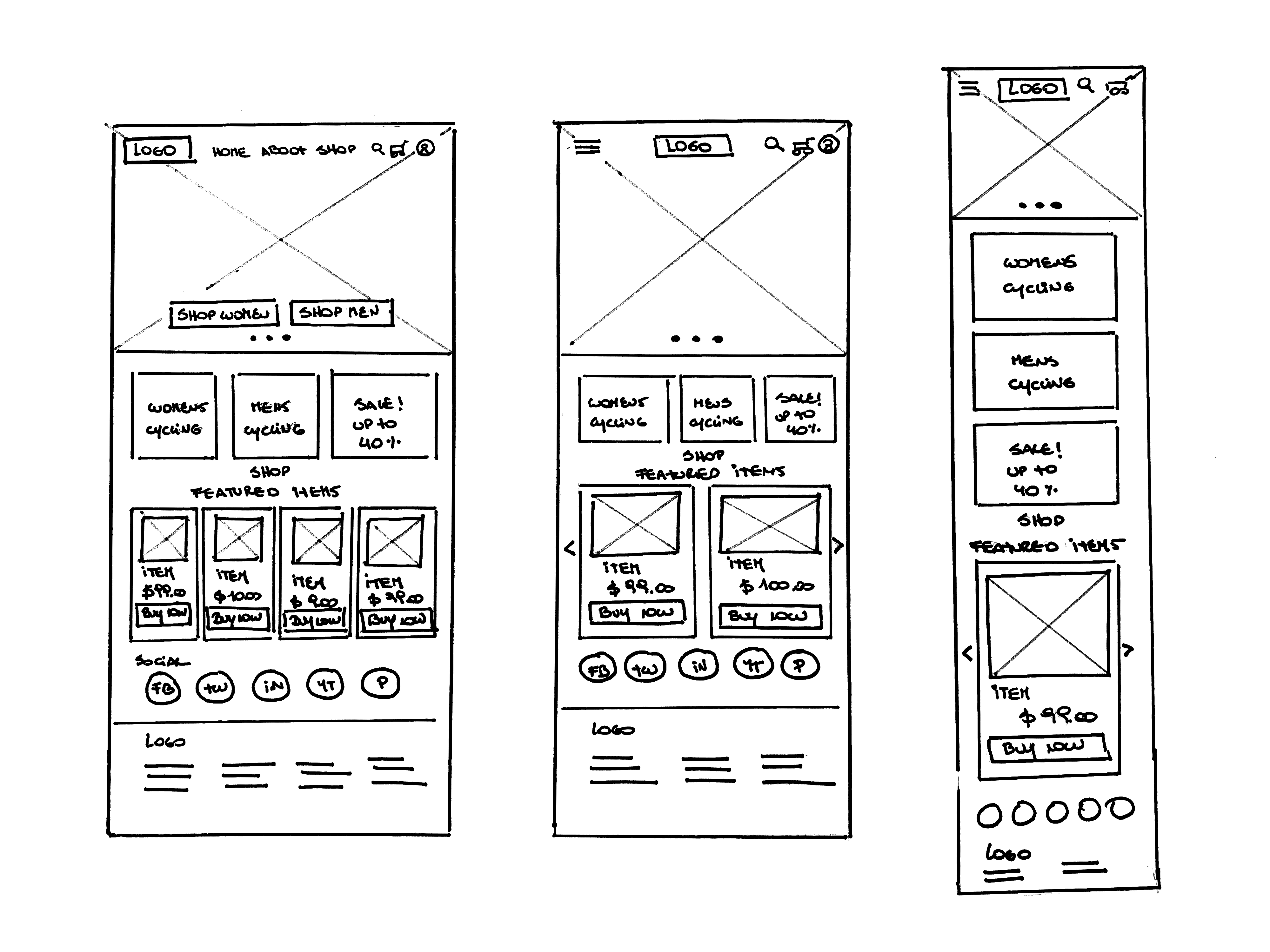
Paper wireframes
Home page | Wireframes & Refined version
For the first version of Zona5 home screen, I prioritized the search of
products through 2 main categories. I included strong cues to make women
feel included and important. The goal was to help these women gain trust
in the online shopping process. Being able to see all the screens of the
app on paper, helped me prioritize the most relevant features to start
working on the digital version.
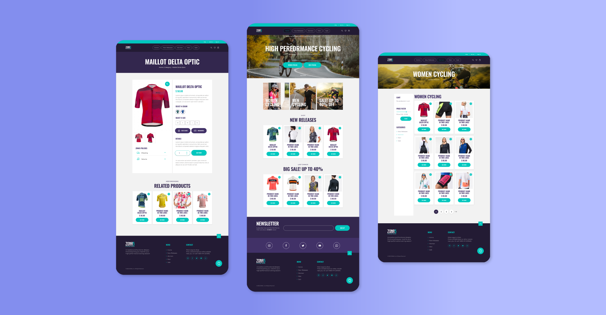
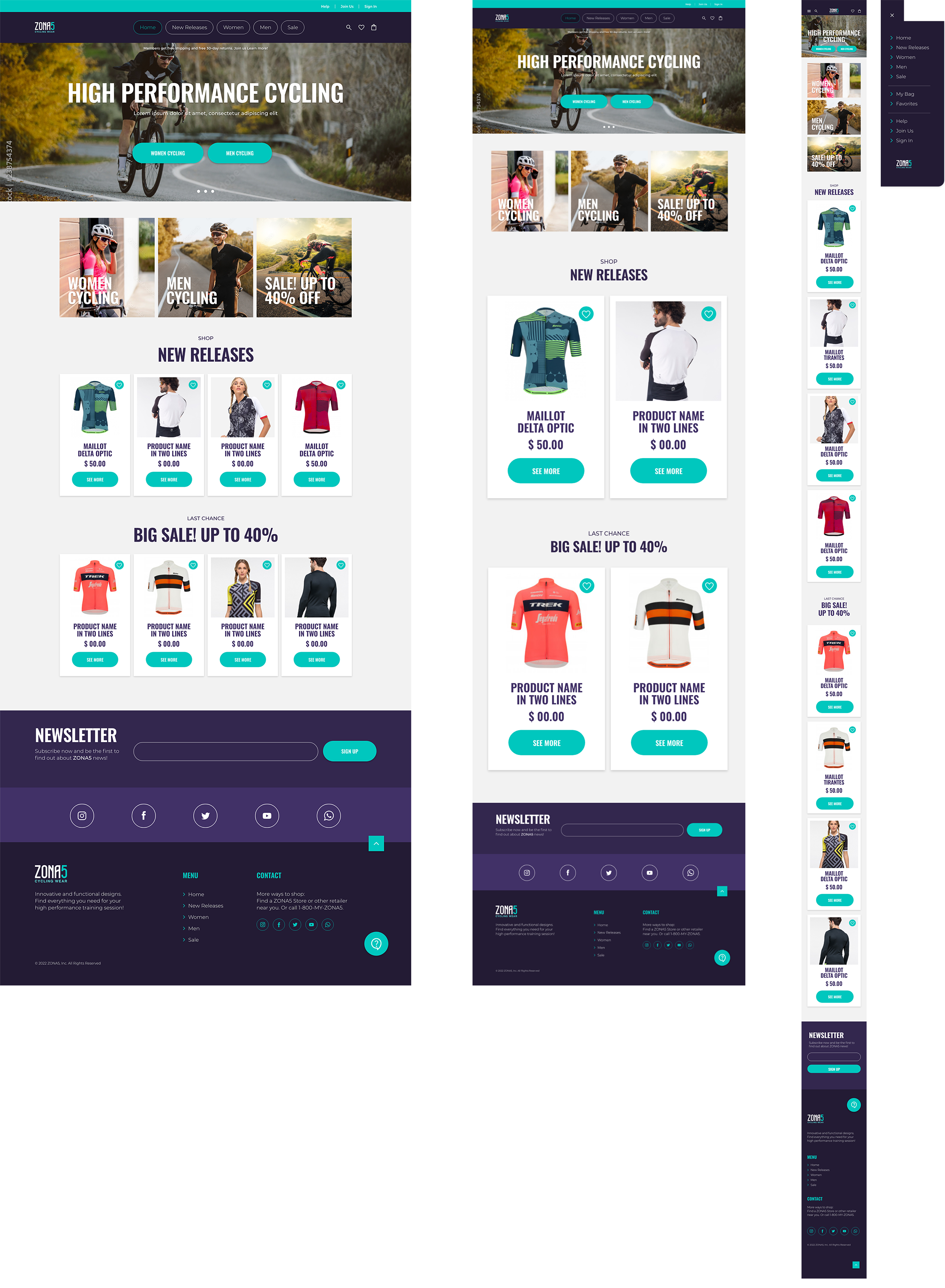
Desktop, Tablet, Mobile
Since Zona5 customers access the site through different types of
devices, I created designs for additional screen sizes to create a fully
responsive website. I adapted my design for Desktop, Tablet and Mobile
versions.
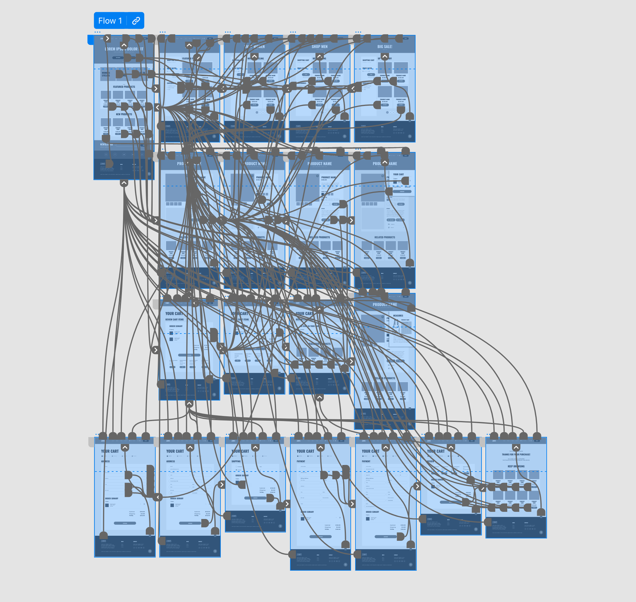
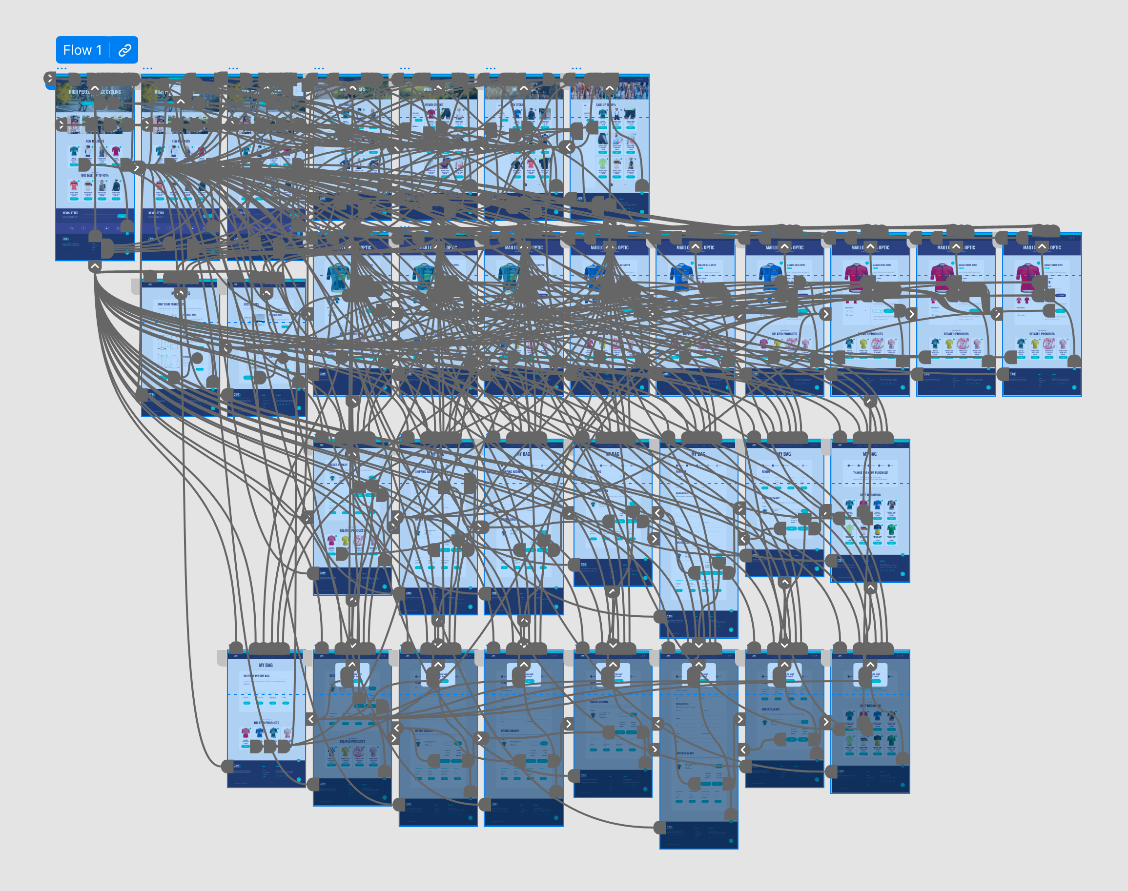
Site Map
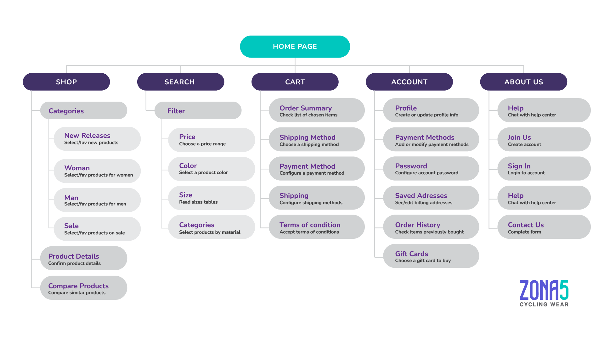
Start the design
Digital wireframes
After the interviews process, I made sure to give users clear cues to
find products through most requested categories (Women, Men and Sale).
During the initial design phase my first concern was the UX during the
product and size selection. To make the process easier, I included only
a few items in every results page in order to use big size images.
Prototype #1
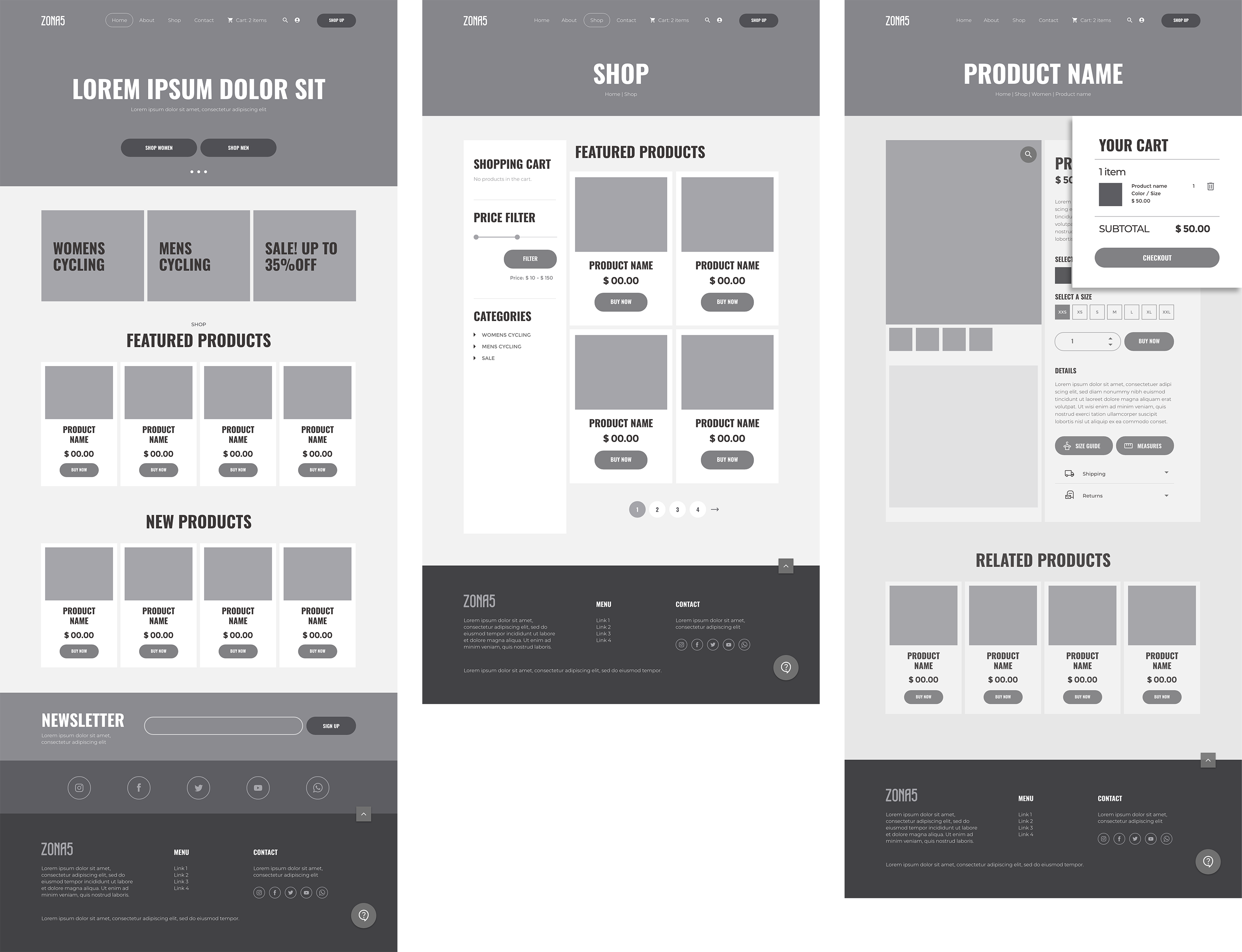
At this stage on the design process, and before running the first
usability study, users had quick access to Measures and Sizes through a
PopUp window. Shipping and Returns policies information was a key user
need to address in the designs. I included a big icon for chat support
at the footer menu and provided users a very easy way to return to top
menu without having to scroll back up.
Prototype #2
Low-fidelity prototype
Before running the first usability study, I used 3 versions of PopUp
windows for the Cart preview, and the Selection of Measures and Sizes.
 LO-FI
LO-FI
Usability study
findings
I conducted two rounds of usability studies. Findings from the first
study helped guide the designs from a wireframes to mockups. The second
study used a high-fidelity prototype and revealed what aspects of the
mockups needed refining.
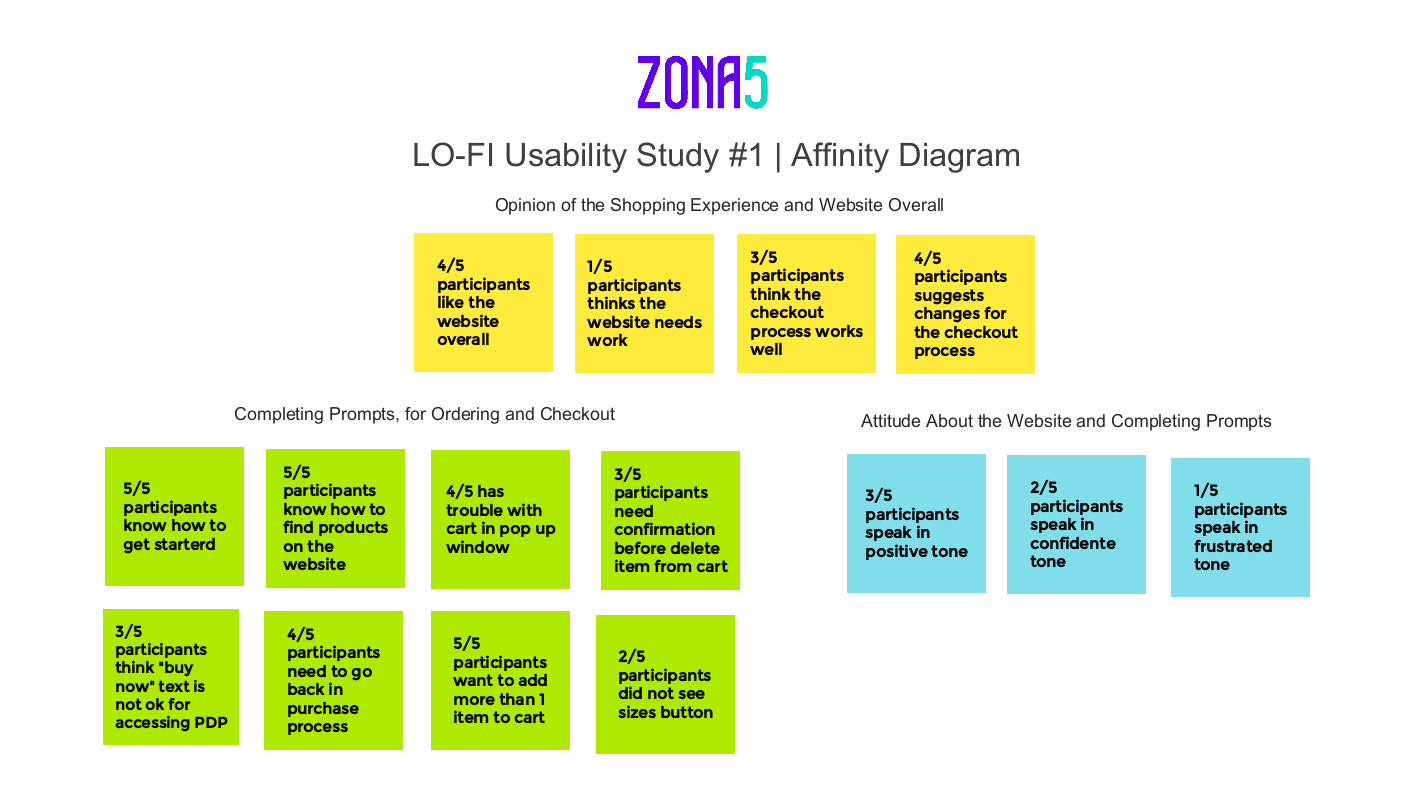
Round 1 findings
- Most users were frustrated with PopUp windows.
- Users need independent sections for Sizes, Measures and Cart
information.
- Need for “Go back” button during purchase process.
Round 2 findings
- Users need a confirmation message before deleting an item from
cart.
- Save time by using shipping information as the billing info.
- Need to edit the quantity of products from a the cart feature.
I used an affinity diagram to separate the data into groups of tasks
which were categorized by areas for Opinion of the Shopping experience,
Completing prompts: Ordering and checkout process, and the overall
attitude of participants.
Refining the Design
After the first usability study early designs required iteration such as
the location of product categories needed at the top menu bar and the
elimination of popup windows. I iterated the product selection and
payment flow. Users clearly expressed the need to edit the amount of
products inside the Bag and to use the same data for billing and
shipping. I removed the SHOP UP button and the About section to leave
room for more important items such as categories.
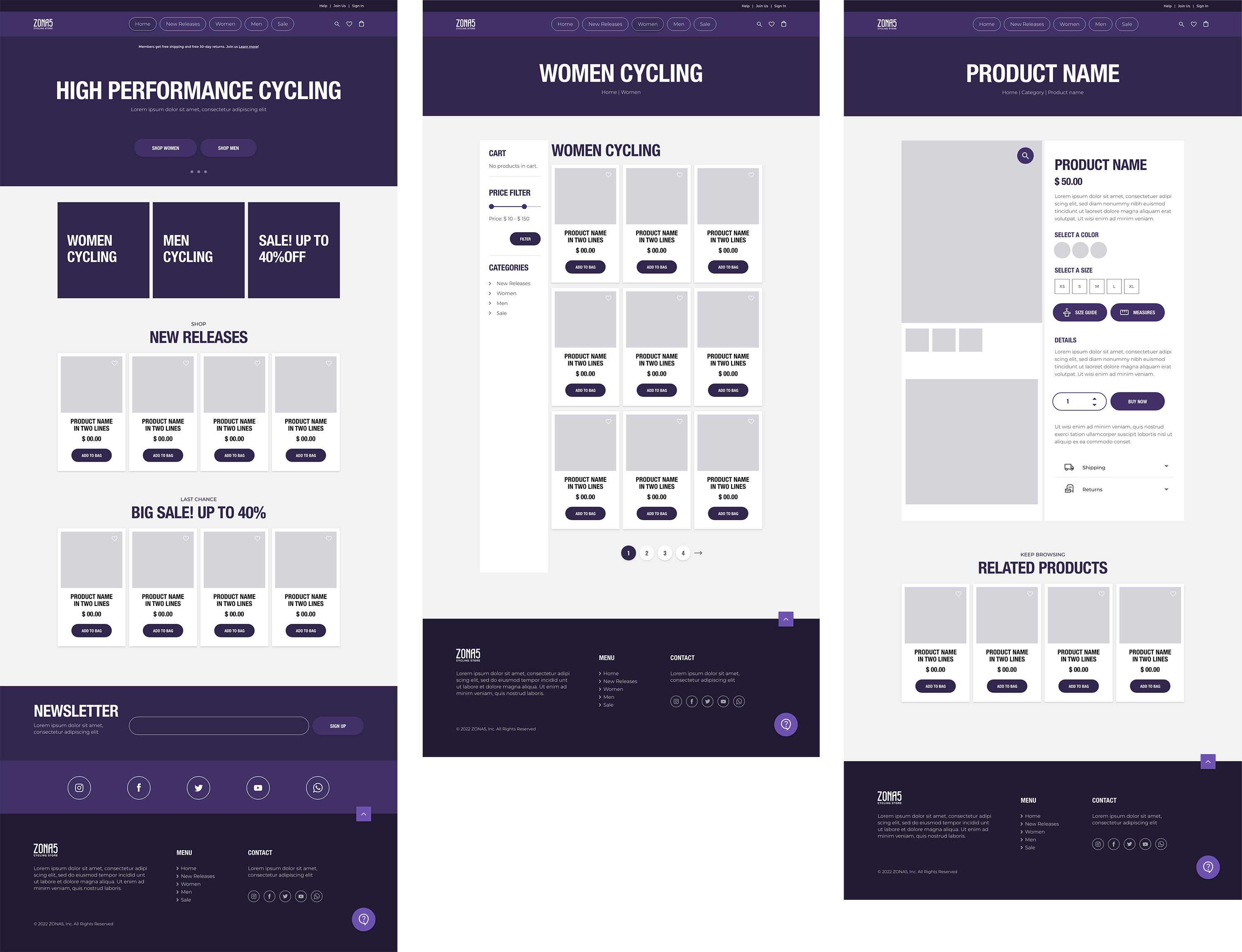
Mockups
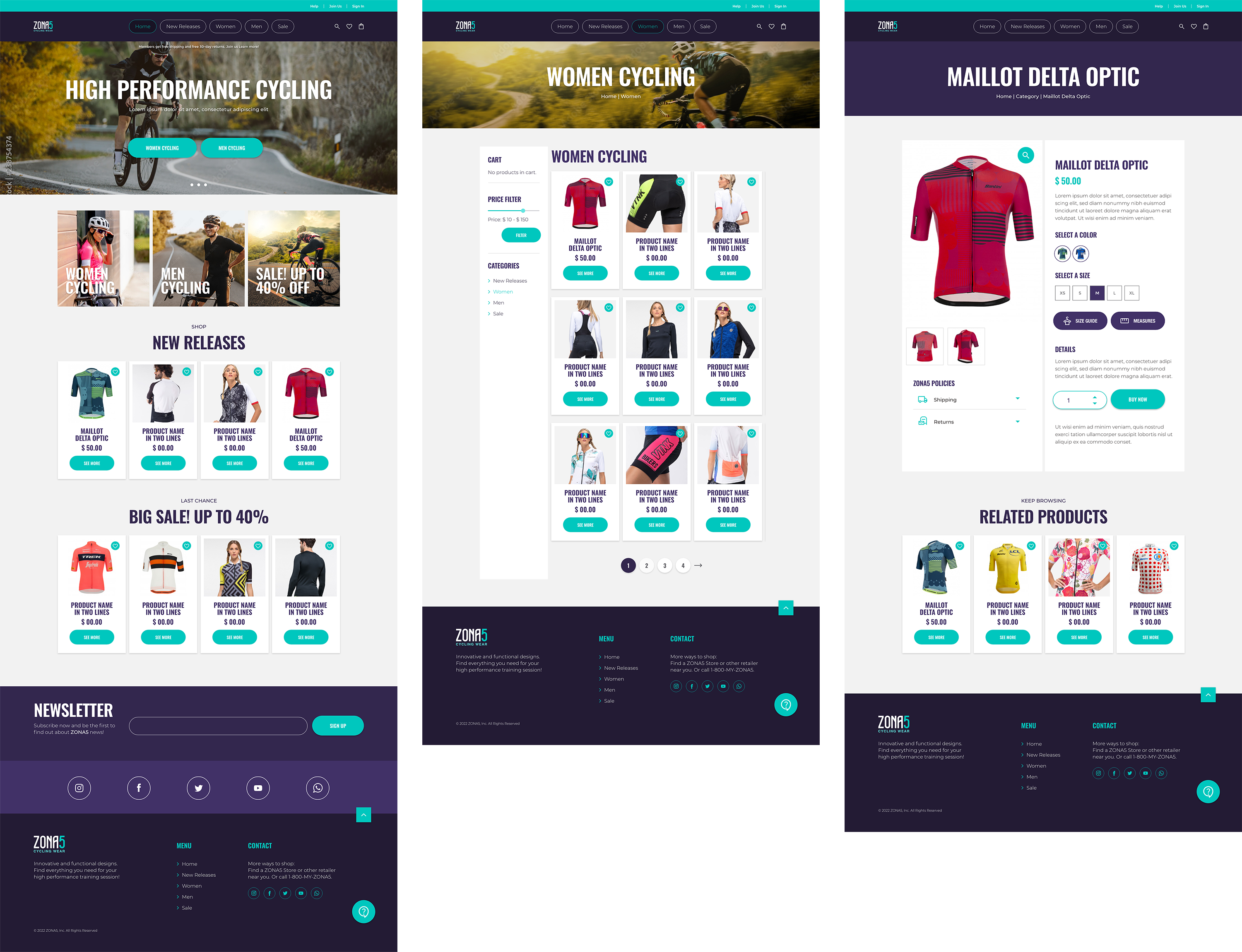
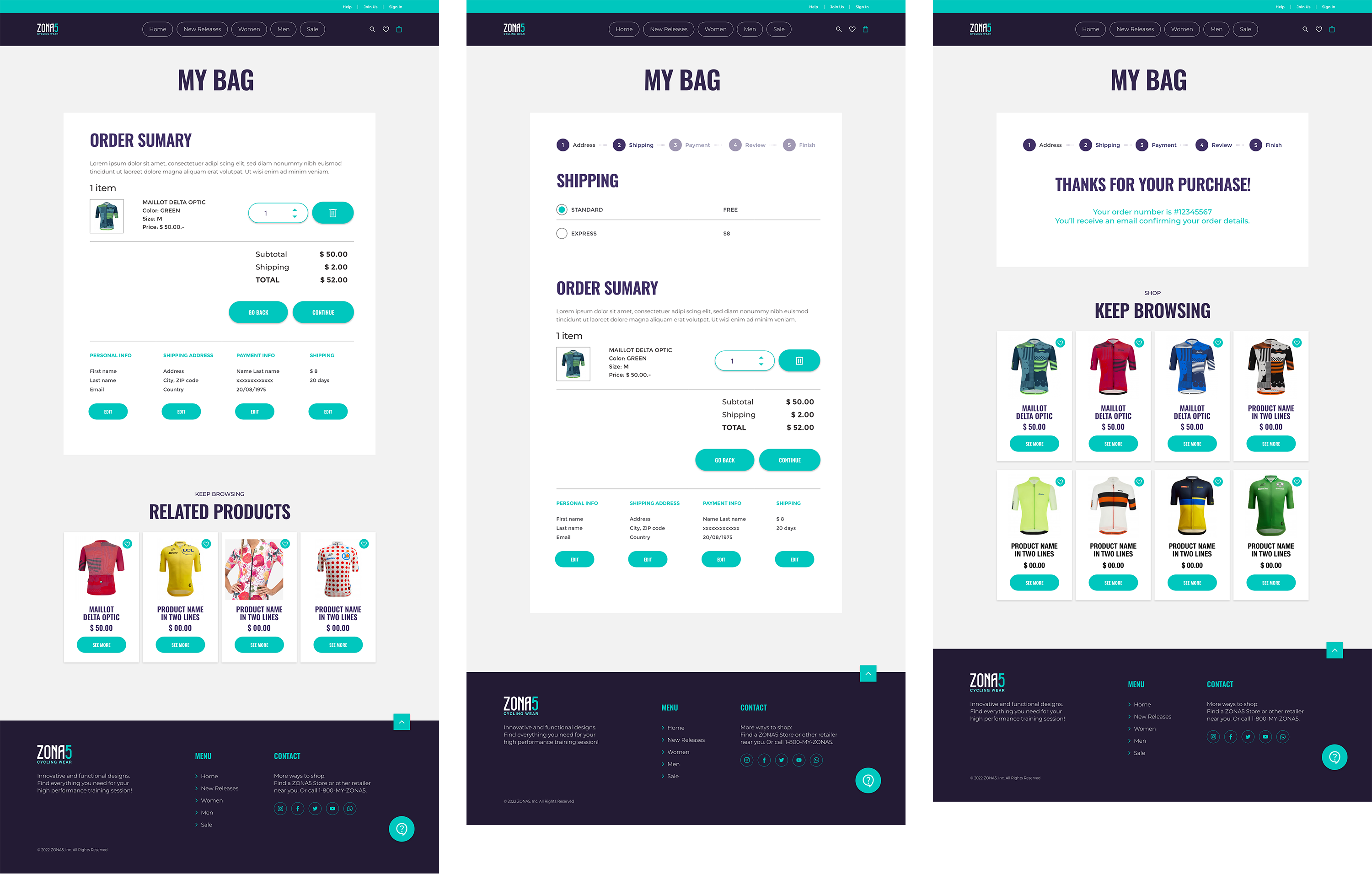
High-fidelity prototypes
The final high-fidelity prototype presented completed and polished user
flows for selecting and purchasing items. It also met user needs for
choosing sizes and colors, learning about measures and provides
availability for chat support 24/7.
 HI-FI
HI-FI
Style Guide
Hi-contrast colors and two family fonts for Zona5 design system.
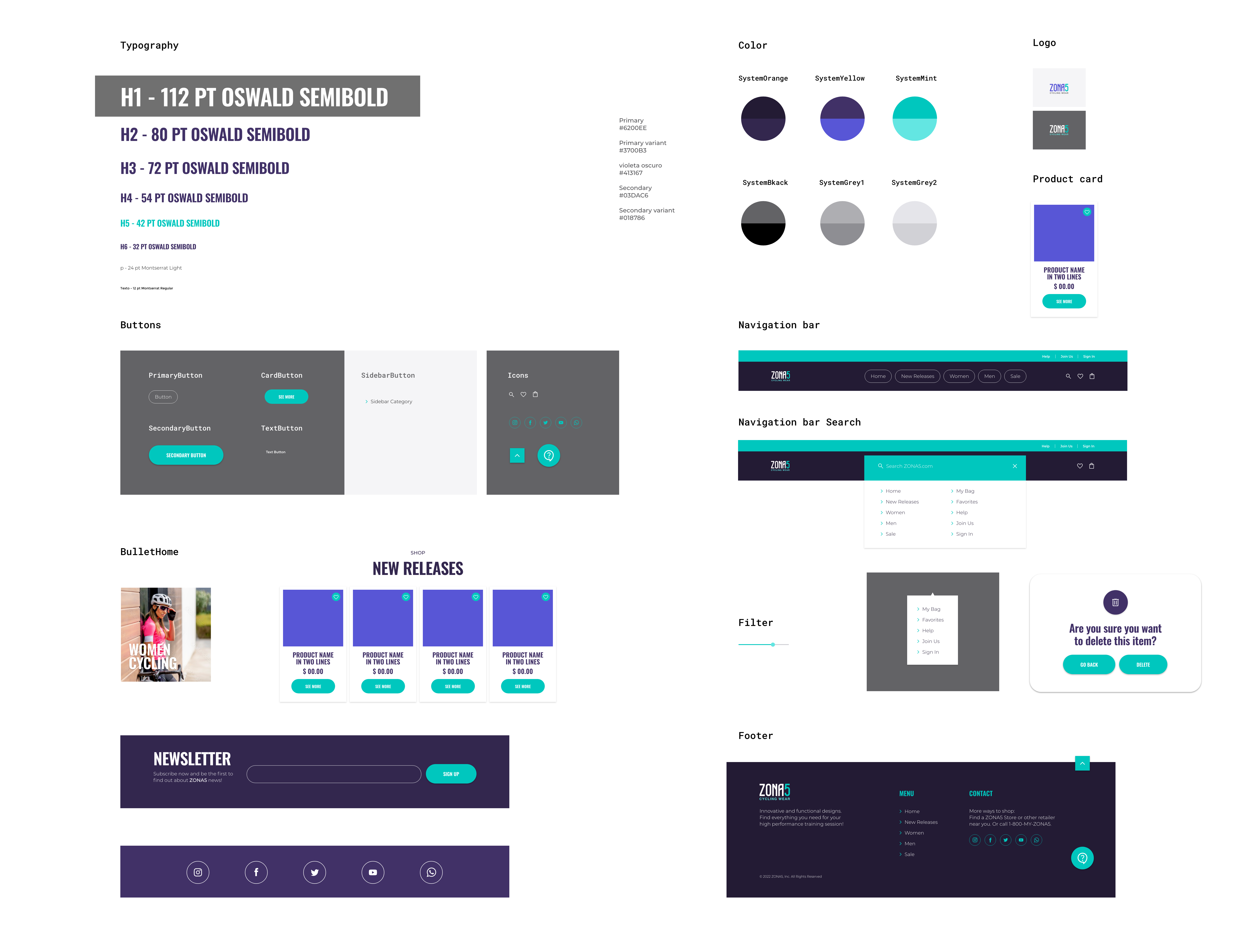
Accessibility considerations
HI-contrast color palette for visually impaired users.
Contrast Ratio: 6.43:1
Detailed imagery for product selection.
Lengthened time-out during payment process.
Navigation through different location and sizes for categories’
menus.
Responsive design
Mobile, Tablet and Desktop
Takeaways
Impact
Project goal was achieved. In the 2º Usability Study every participant
was able to select a product and complete purchase process through the
website.
Quote form Participant Nº 3:
“The process to buy is super easy. I would definitely like to
see more sites like this”.
What I learned
I learned that it’s okay to completely modify everything in a website in
order to create a fully responsive product. Rule number 1: keep the user
front and center, no matter what device they are using. Looking back to
the process I went through to create this e-commerce website, I learned
that testing prototypes over and over with users is probably one of the
most interesting parts in the Design Process.